Grafana has become a very popular tool for monitoring systems and applications partly due to the amount of features and integrations it provides. The graphs it produces are beautiful. However sometimes you need to show a string or a value instead of a full graph. For that purpose Grafana provides the “Stat” panels. These are very often used to show a single value, such as the last reading or the moving average of a given metric.
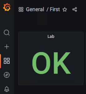
However sometimes you want to display a string. An example of this could be a “health” status, such as OK or CRITICAL
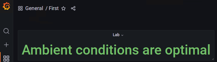
or it could be some some other message you are collecting such as this
We are going to show how to handle this scenario but for completeness let’s use some Python code. In this example we will be collecting some environment data and storing it into InfluxDB. On every interval we are going to:
- read 2 numerical values (Temperature and Humidity)
- infer a “Health” text value by comparing the 2 previous values against some threshold
- write all 3 values to the database
The code requires you to install the “influxdb” Python library. You can do so with “pip install influxdb”
# Import the Influx client from the Python library
from influxdb import InfluxDBClient

# Create a connection to InfluxDB
client = InfluxDBClient(host='localhost', port=8086)

# Connect to the right database
inf_db = "iot_database"
client.switch_database(inf_db)

while True:
    # Read the data from your sensors or a REST API ...
    # Let's say we got:
    temp = 25
    hum  = 60

    # Depending on some predefined thresholds we could derive the Health
    if temp < 35 and hum < 80:
        h = "OK"
    else:
        h = "CRITICAL"

    # Then we write the data
    data = 'warehouse Temperature={},Humidity={},Health={}'.format(temp,hum,h)
    client.write([data],{'db':inf_db},204,'line')

    # Pause for 5 seconds until the next iteration
    time.sleep(5)
Now let’s see how we can use the “Health” text value in Grafana. Add a “Stat” panel to your dashboard and on the query section you need to “format as table” and select the “last” value.

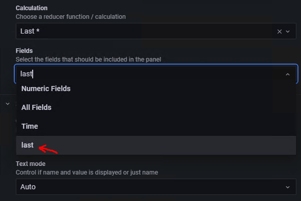
At this point the panel will still display “No data”. So you need to go to the “Options” section on the right pane and scroll down to “Fields”. By default, “Numeric Fields” will be selected, but you need to select “last”
Additionally you might want to set “Graph mode” to “None”. By default Stat panels will want to show a graph as well as the value but in this case there is no graph anyway because the “Health” field is not numerical.
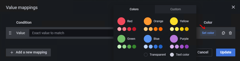
Finally you might want to apply a color code to the text in your “Stat”. Unfortunately threshold-based coloring won’t work because Health contains not numerical values. Don’t despair, we can still color them to our liking by using “Value mappings”. You will find this option at the very bottom of the “Options” pane.
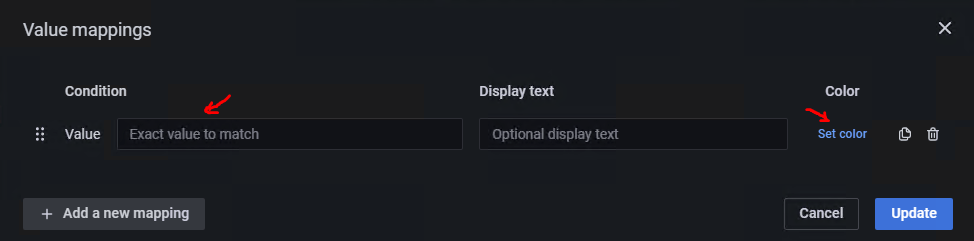
You can add a “new value mapping” for each type of health status your code is producing, ex: OK, CRITICAL … Specify the value to match on the left and the color on the right as shown above
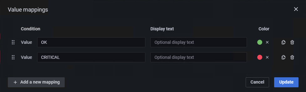
In our simple code we had only 2 different health status hence our resulting value mappings is as follows
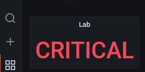
So now when the sensor data is above the threshold we write Health = CRITICAL and it displays as follows:
In a future post I will share some tips to build a hierarchy of dashboards including a front dashboard to be used in your control center with a visual snapshot of your entire operation
Categories: DellEMC

